Quick styling tricks before selling an investment property
When you’re selling a Neutral Bay investment property, you may not be able to put the time and effort into preparing it that you would when selling your own home.
Of course, this doesn’t mean you still don’t want to get the best possible price for your Sydney real estate.
With a basic understanding of design and interiors, you can maximise the appeal of your investment property without the need to drastically change it. It’s all about finding the right balance and focal points for each room.
Quick styling tricks for home sales
To successfully style a home, you need to understand the six basic principles of design.
These are universal principles that apply to all forms of visual arts but are easy to grasp and can make a big difference when you prepare your home for sale.
Before getting into design principles, remember the number one piece of advice when you style a home for sale: keep it neutral so that potential buyers can see themselves in the space.
Next, remember that a house needs to be clean and uncluttered to get the highest price, so a thorough scrubbing and a tidy-up are always in order.
Now let’s take a look at the six principles of design and how you can apply them to styling your investment property.
Scale
Scale, as you may have guessed, is about size.
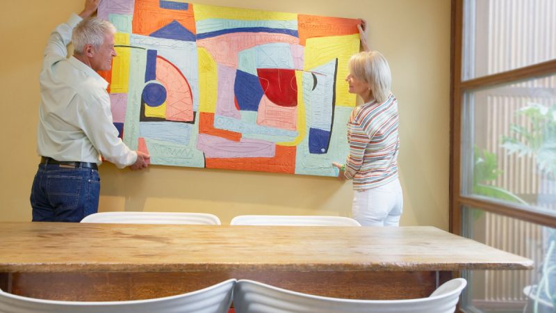
More, though, it’s about comparative sizes. For instance, if you have a large wall, you don’t want to put a tiny, postcard-sized piece of art on it. You want to find a large piece to match the space.
Scale is about using the right-sized pieces for the space at hand. Large rooms call for larger furniture and smaller spaces for smaller pieces. Get it wrong, and a small room will feel smaller, and a large room will look oddly empty.
Before you sell, take a look around at furniture and decor to see if anything isn’t quite right for the room.
Focus
Focus applies to where your eye is drawn in a room.
Usually, there should only be one focal piece in a space. Having more than one can create visual confusion and make a room feel cluttered.
A focal piece can be a standout piece of furniture, a large painting, a feature window, or basically anything that draws someone’s eye.
Not every room needs a focal point, but in most cases, it will help. If you are struggling, step back and look at the room, its layout and its function. A room with one entrance often works best with a focal point opposite the door. Open-plan rooms can be made into separate spaces by creating different focal points.
Often, rearranging things can give buyers a focal point when they come through for an inspection.
Balance
If a room is not balanced, it can feel slightly off when you walk in. A well-balanced room feels comfortable and easy to be in.
Balance comes in two forms:
– Symmetrical balance: This form is about the space along a central line with identical or similar pieces on each side.
– Asymmetrical balance: You can still achieve balance without symmetry. When you use asymmetrical balance, you choose pieces that are different for different sides of the room but still hold a similar visual weight. For instance, a bookshelf on one side of the room can be balanced with a large couch on the other.
Again, rearranging or removing things can create that more appealing first impression.
Harmony
Harmony is more of a feeling than anything else.
It’s when all your choices of furniture and dressings, paint schemes and all the other elements of the room feel like they fit naturally together.
Harmony can be impactful between different rooms. A vastly different paint scheme in one room of the property will feel unharmonious, unless each room is deliberately different.
This may take a little work if a fresh coat of paint is required, but it will be worth it.
Rhythm
Rhythm is a form of repetition.
With this in mind, creating rhythm in a room is about repeating shapes, colours or styles, such as stripes, palm prints or a particular colour scheme.
By evenly repeating a form or colour across a space, the eye is comfortably drawn around the room, taking everything in.
Contrast
Contrast is almost the opposite of rhythm.
Like rhythm, you can create contrast in multiple ways by utilising shapes or colours.
A large piece of brightly coloured statement art in an otherwise neutral room can create excellent contrast. It will also be a feature piece creating focus so you can see how the principles work together.
You might also use rounded furniture in a room that has a lot of angles. This is also a way to balance the room. Again, the principles work together.
Putting it all together
The most important thing is not to get too bogged down in the details of these principles. It’s far more about feeling than exactness. If you feel something looks right, it probably is.
It can also be a great help to have someone else come in for a quick look around so you can see how they feel in the freshly styled home. An impartial eye will pick out minor flaws that you will easily be able to fix.
The last question is whether you can do this with tenants in place. If your investment property in Neutral Bay is leased, you may be limited. When you work with an agent who is confident they can achieve a quick sale, it can help to wait until the lease has expired, then create a ‘haven’ that buyers will fall in love with.
Finally, if you need more advice but don’t want to splurge on a stylist, ensure you work closely with your real estate agent. Agents understand what sells, and will be able to guide you wherever you are having trouble.
Need help to sell your Neutral Bay investment property? Get in touch today.


